The Small Acorns Fund
Fund brand identity
The National Brain Appeal is the charity dedicated to raising funds for The National Hospital for Neurology and Neurosurgery in London. The launch of The Small Acorns Fund gives front-line hospital staff the chance to apply for funding to fast-track small scale projects that could have a big impact and benefit to patients. This simple logo represents the programme by using a shift of perspective to illustrate the metaphor to which Small Acorns alludes. Since The Small Acorns Fund was launched in 2013, The National Brain Appeal has awarded more than £200,000 for 70 projects. Funded projects range between £500 to £5,000 and each year one exceptional grant of £10,000 is also considered.
Axminster Tesco Superstore
Movember campaign identity
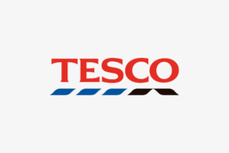
The Tesco store in Axminster wanted to raise money and awareness for Movember by staff growing moustaches. Movember is the leading charity changing the face of men’s health and helps address some of the biggest health issues faced by men: prostate cancer, testicular cancer, and mental health and suicide prevention. The store wanted to promote the cause to it's staff so they could get involved and to it's customers so they could donate money throughout Movember. Campaign material simply adapted the original Tesco logo to reveal the hidden moustache.
The National Brain Appeal
Thirtieth anniversary identity
The National Brain Appeal is the charity that raises funds for The National Hospital for Neurology & Neurosurgery. Their annual review which commemorates its 30th Anniversary used the charity’s existing branding device of a profile portrait to cut out the counter in the '0' of the 30.
Susan Harrison Retail
Retail property consultant identity
With over 20 years’ experience in the UK commercial property sector as a specialist retail and leisure consultant, Susan has worked both in house with the likes of Signet Group, Bass PLC, Burger King and Brantano and on a consultancy basis with Arcadia, Caffe Nero, The Gym Group, Neptune and Brantano. After deciding to launch her own consultancy in 2020, Susan needed an identity that expressed the broad variety of properties and retail companies that she works with. We also wanted to capture her talent for looking beyond the obvious to find unusual and exciting retail spaces and for finding solutions for more challenging properties. We worked with Susan on the logo to create something that felt structural and would also reveal an 'S' when you look beyond the sum of its parts, because not only does Susan look beyond the obvious, she is also at the heart of making things happen for her clients. She puts a huge emphasis on her personal touch and dedication to getting the right space for her clients.
Beare Violins
Fine antique violin authenticators identity
Beare Violins specialises in issuing certificates of authenticity for fine antique instruments of the violin family, signed personally by Charles Beare. They also help clients to buy and sell fine violins, violas, cellos and bows and carry out specialist restorations through their small, experienced workshop. John and Arthur Beare founded the family run business J & A Beare Ltd back in 1954 and built their reputation on care and expertise. Under new direction from Peter and Charles Beare the company changed it's name to Beare Violins Ltd, but they needed a new identity that could not only be used as a logo but as a guarantee and seal of authentication for their high value violin certificates.


